C Cube

| 0 comments


Format: MP4
Resolution: 320x240
Language: Jap w/ Eng Subs
File Size: Max. of 35MB

Genres: comedy, fantasy, psychological, romance
Themes: curses, ecchi, fanservice, school

Plot Summary: A school battle action & love comedy with ecchi elements. Yachi Haruaki is a high school boy and naturally resistant to curses.
His father, Honatsu, sends him cursed instruments called "Worse" to try to break this. One day, Haruaki receives a black cube from Honatsu. During
the night, he encounters a naked silver haired girl stealing rice crackers. She is the human-form of the black cube, an instrument of torture called
"Fear in Cube". Haruaki and the girl 'Fear' fight together against other 'Worse' instruments and their owners using Fear's 32 mechanisms of torture.


Episode 1 "I Have No Idea Who Goes to Bed"
Episode 2 "Do Something, to Something, to Somewhere"
Episode 3 "The Antinomy of Their Temperatures"
Episode 4 "At Night, a Mother and a Hugging Pillow"
Episode 5 "Even If I Were to be Cursed"
Episode 6 "A Frail Sphere Glass-Like Thing"
Episode 7 "Not Reflected in the Eyes of a Seer"
Episode 8 "Like An Unescapable Curse"
Episode 9 "The Returnee is Strange Somewhere"
Episode 10 "The Sadist is Nowhere to be Seen"
Episode 11 "The Fanatic is Somewhere
Episode 12 "The Sovereign is Everywhere"

True TV HD

| 0 comments

HGTV

| 0 comments


How to Turn Humdrum Photos Into Cinematic Portraits

| 0 comments

There are a plethora of ways to treat a portrait, for a myriad of uses, but that is for another feature. Let’s tackle adding drama or a cinematic quality to a regular, humdrum portrait. Let’s even throw in a little bit of faking HDR. That way if you work on a project that requires a stunning shot without the stunning photography, you’ll be able to cobble something together using your mad skillz!

Asset Preparation
The images I’ve used are: The man, the cloud, the water drops 1, and water drops 2. As always feel free to use your own images, however you may need to tweak the settings of any of the steps to get the right effect with different assets.

Step 1
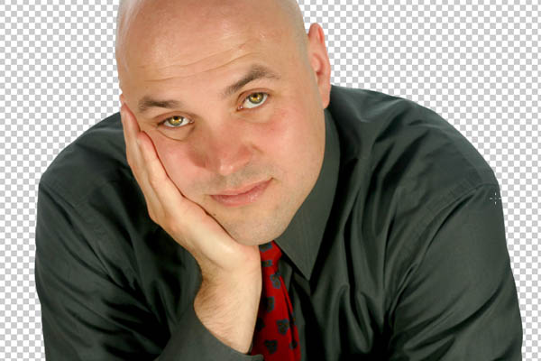
Open the man image from iStockphoto and separate him from the background. Use whichever method you’re comfortable with, I would usually use the Pen Tool, but I’ll be honest, as he’s got no hair to worry about and the background is white I kinda cheated. I used the, ahem, Magic Wand Tool to select the white. I then Feathered the selection by 1 pixel (Select > Feather), expanded it by 2 pixels (Select > Modify > Expand) and hit delete 2-3 times until the white halo disappeared. Call this layer “MAN.” Select the Dodge Tool, set the Range to Highlights and the Exposure to 15% and run it over the Iris a couple of times. This should bring the eyes out a bit.

Death Bell 2: Bloody Camp

| 0 comments


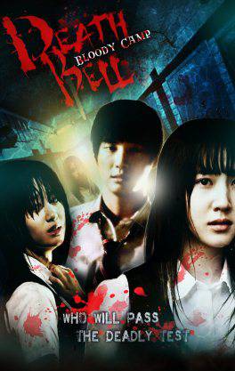
Summary: In South Korea, the high school student and swimmer Jeong Tae-yeon (Yoon Seung-ah) is found dead in the pool, which is found as a suicide. Two years later, teacher Park Eun-su
(Hwang Jung Eum) joins the high school where Tae-yeon’s stepsister Lee Se-hui (Park Ji-yeon) is haunted by nightmarish visions and is bullied by the student Eom Ji-yun (Choi Ah-jin).
Eun-su finds it difficult to get respect in the classroom and is backed up by an older teacher, Cha (Kim Su-ro). Se-hui and her classmates are selected for an elite “study camp” 
held at the school during the summer break where 30 students study for their university entrance exams. The school’s swimming trainer is murdered in the showers, 
and the words “When an innocent mother is killed, what son would not avenge her death?” found scrawled on a blackboard. A voice warns the students that they’ll all be killed 
unless they can answer who is the murderer and why. The students and teachers find they’re locked in the school when more deaths begin to happen.


Download link:
http://www.mediafire.com/?mt8it31qjovc1vt
http://www.mediafire.com/?y04s9g89diuyldm
http://www.mediafire.com/?chfn43vflzira3k
Eng Sub: Included

Death Bell

| 0 comments


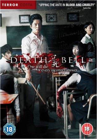
Summary: The film is set in a high school, where an elite group of twenty students—including rebellious heroine Kang Yi-na, her timid best friend Yoon Myong-hyo, 
and her would-be boyfriend Kang Hyeon—are taking a special class for their college entrance exam. After Kang Yi-na is nearly strangled and another student throttled
in the restroom, the classroom TV screen switches to an image of top-ranking student Hye-yeong trapped inside a fish tank that is slowly filling with water. 
A disembodied voice announces that her life depends on the exam questions he will set for them, and that a student will die for every question the class gets wrong. 
Trapped with the students are head teacher Hwang Chan-wook and English teacher Choi So-yeong. Someone is slowly killing the students one by one, but who are they? And what do they want?


Download link:
http://www.mediafire.com/?03enys3uby46ync
http://www.mediafire.com/?81mbw5jjd18m2md
Eng Sub: The subtitles are there, but you’re going to select the English subtitles because the Korean sub is set to default.

Using Tools from Photoshop's Toolbar

| 0 comments

Now it's time to learn how to use some of the tools in the Photoshop toolbar.

Marquee Selection tools: The following tools allow you to select regions in your image to alter, copy, move, and apply filters. 

This is the default selection setting. You can make a selection of any rectangular size and shape.

Elliptical marquee tool: This tool, available when you click and hold down on the selection tool region of the tool bar, selects elliptical spaces. To select a round area, hold the shift key while clicking and dragging.

Single row: This tool will select a 1pixel region that is as wide as your image. Very useful for trimming edges and making straight lines.

Single column: The tool will select a 1pixel region that is as tall as your image. Also very useful for trimming edges and making straight lines.

A Note on Selection Modes (in the options bar):


# Normal mode allows you to drag the cursor to create the selection size you want.
# Constrained aspect ratio allows you to choose a scalable rectangle, say with a width to height ratio of 1 to 2. The selection will grow when you drag, but will remain the same shape.
# Fixed Size/Fixed Aspect Ratio allows you to predetermine the size, in pixels or a ratio, of the selection you will make. When you click with fixed size selected, a selection box of the exact size you specified will automatically appear. With fixed aspect ratio, you can make different-sized selections of the same shape. This is a particularly helpful tool when cropping images to a certain size or drawing identical boxes.

Move Tool
the move tool moves an entire layer at a time. When you have selected this tool, click on a layer in the layer pane, and then click and drag on the image. The current layer will move all at once. You can even move it outside of the current image size. Don't worry, though, parts of an image that move outside the borders still exist - they are just hidden. They will only be cropped out if you flatten the image. 

Lasso tools
The lasso selection tools are similar to the marquee tools, except that the lasso tools give you ultimate freedom in terms of the shape of your selection. There are three different lasso tools:

Lasso tool, which allows you to draw a selection by dragging the cursor freehand. The selection will close itself.
Polygon Lasso tool, which creates a selection composed of straight lines that can be as short as one pixel. The selection grows with each additional click. This tool is especially useful for cutting out objects in an image to place on new backgrounds.
Magnetic Polygon Lasso tool works a little like a combination of the other two lasso tool. As you drag, the selection maps to natural borders in the image. This is a useful tool when dealing with well-defined and high-contrast images.

A note about lasso tool options: When extracting part of an image from its background, the result will be choppy and rough around the edges unless you adjust the feather value in the options bar. This fades the edges you create and can smooth the region into its new background.


Magic Wand Tool
The magic wand tool is similar to the magnetic polygon lasso tool except that rather than dragging to make a selection, you click in a region and a selection appears around similar colored pixels. You can control how similar pixels must be to be included in the selection by altering the tolerance value.
This tool is useful for selecting monochromatic regions or pieces of high-contrast images. 

Using the Image Menu

Most basic Photoshop tasks involve the Image menu, which I showed you earlier. In this chapter of the tutorial, I’ll go a little deeper into what you can do with the Image menu. I'm skipping around a little here; this represents the most commonly used items on the Image menu. 
Mode
The first item on the Image menu is Mode. This is what you use to change the color mode and appearance on the entire image. I discussed RGB, the web mode, and CMYK, the print mode, earlier. You have some other choices here, including grayscale and duotone. Some modes’ availability depends on the pre-existing color mode.


Adjust
You can see that the adjust option on the Image menu gives you a lot of different tools for adjusting your image. The most basic types of adjustments you can make with Photoshop involve colors and brightness.

The most simple is the contrast/brightness adjustment. When you select contrast/brightness, you are confronted with a dialog box with a slider for both brightness and contrast. Moving the sliders to the left makes the picture more murky or darker, and moving the sliders to the right brightens and increases the contrast between the dark and light colors in the image. You can play around with both sliders until you get a suitable mix; the change is previewed in the image. This tool is helpful for brightening pictures that were taken in low light.


The other adjustments you can make with the options on the adjustments menu are a little more complex, and the best way to learn about them is just to experiment. Because Photoshop allows you to preview your adjustments, you can get a good feel for the adjustments without hurting your image.


Image size
Another common basic feature of Photoshop that lives on the Image menu is image size. You use this function to resize an image, and it’s pretty straightforward. When you select image size from the Image menu, a dialog box appears with some numbers corresponding to the current size.

You'll notice that there are two sets of sizes, Pixel Dimensions and Document Size. Pixel Dimensions refers to the image's size on screen, and Document Size refers to the size at which the document will print.You'll notice that all the numbers change when you change one of them. This default setting preserves the original h/w ratio of your image when you make changes to it size. If you want to change only one dimension of the image, uncheck the "constrain proportions" checkbox at the bottom of the dialog.

Notice that in the Documents size settings, you have the option to change the resolution (remember, things images will always be approximately 72 pixels/inch on screen). You can use this to change the resolution of your image, but remember, if you don't want the quality to decrease, you should only go from hi-res to low-res.


Canvas Size
Canvas Size is similar to Image Size, but changes to an image's canvas size can provide you with more working area for your image, in case you want to annotate it, copy more images into it, or perform. any number of other graphic variations. 


Crop
The Crop function in the image menu is fairly straightforward. Make a selection, go to Image and select crop, and then everyting outside your selection disappears. The image size reflects the change.

Creating Graphics in PhotoshopAn advantage of Photoshop over basic photo editing software is the capabilities it gives you to create your own graphics. There's an exhaustive number of tools in Photoshop (and resources about them), so I'll just cover the basics.

Most of the functions these tools perform are based on your selection in an image. The effect or tool only operates within a selection.

Make a small selection and select the paintbrush tool. Move the mouse over your selection holding down the mouse button. You'll see that the image is only altered within the selection.

Colors and Graphics

Before I get to some of the main tools, I'll tell you a little about colors. The foreground color, which will be applied by tools like the paintbrush, is represented by the top square in the middle of the toolbar. 

Stroke & Fill

The most basic ways to apply colors to an image are to use Fill and Stroke, both available on the edit menu. Make a selection, and choose fill from the edit menu. A dialog will appear asking you to make some decisions about colors and transparency. Make your selections, and press OK to fill the selection with the chosen color. Stroke operates in much the same manner, though you are given the chance to determine the weight of the lines you create. 

Familiarizing Yourself with the Photoshop Interface

| 0 comments


Welcome to the wonderful world of Photoshop. This tutorial covers the basics of how to use Photoshop to work with your digital images. The intent of this tutorial is to introduce you to the concepts at work in Photoshop; however, the best way to develop your skills is to experiment with the programs. This first page will point out some of the features of the Photoshop interface and define a few terms I'll use throughout the tutorial.

Open application

The first step, of course, is to open the application. In the IT lab, you can find Photoshop in the folder marked Adobe in the programs menu (from the start menu). It may also be located in a start menu folder called Graphics.

Once you have opened the application (after a few moments of loading time), the Photoshop interface will appear. There are many complex elements of the interface, and for reasons of both saving space in this tutorial and keeping things basic, I’ll only show you the toolbars and options panes you need to perform the most basic tasks in Photoshop. If you ever notice that some of these elements are missing, simply go to the window menu and select them.

Elements of the Interface


Perhaps the most important element of the Photoshop interface is the toolbar. It contains a bunch of icons that represent the different tools Photoshop offers to alter and create images. These include tools for selecting specific areas of images, changing the colors of the image, stretching, transforming, and erasing parts of an image, and many more. To get an idea of what some of these tools can do, mouse over the icons and you’ll get an explanatory tool tip. I’ll explain some specific tools in the following sections of this tutorial.


Panes are also important features of the Photoshop interface. All sorts of information is displayed in these panes, and therefore they can get a little confusing. They display location information, tool options, and history, among other things. If you ever lose track of a specific pane (they tend to stack up), go to the windows menu and select that pane to view it. I’ll talk more about the specific panes later on in the tutorial.


Menus are probably the most familiar interface elements to a new Photoshop user. They contain all sorts of options, but since there are not as visible as panes or the toolbar, they are often only partially explored. I’ll take time right now to go over the menus and give a brief description to orient you to each.


* File contains all of the stuff you’d expect it to, with a few extras including Import, which deals with scanning, and Save for Web, which allows you to export a web-ready image from your Photoshop file.
* Edit is another familiar menu. In Photoshop, edit houses all of the expected options as well as Fill & Stroke, and other image-altering functions.
* Items on the Image menu effect a whole image, for the most part. Here you’ll find color adjustments, size adjustments, and any other changes you need to make globally when working with a Photoshop file.
* The layer menu is similar to the image menu, but it contains options that effect only current or selected layers. I’ll explain layers a little later, but for now, just understand that an image in Photoshop consists of stacked transparent layers; options in the Layer menu affect these pieces of the image rather than the complete image.
* The select menu deals with selections you make. Selecting the specific parts of an image you’d like to alter is a difficult part of working in Photoshop. This menu gives you some options regarding selections, including the ability to save selections, reverse them, or add to them. Learning the options on the selection menu can really save you some time.
* The filter menu is probably what most people think about when they think about Photoshop. The filter menu allows you to apply filters to any part of your image. These filters include ways to change the texture of the image, with some potentially radical results.
* The view menu is where you change the view settings. You can use this to show and display guidelines on the image, and to zoom in and out, among other things.
* The window menu allows you to toggle back and forth between hide and show for each interface element. This is the first place you should go if you lose track of a particular window while you’re working.
* Last and least, of course, is the help menu. The help documentation isn’t so helpful, but for some reason, this menu contains two nice features: resize image, and export transparent image, which I’ll get to later.

The options bar, which is located directly underneath the menus, is a useful tool when working with the different Photoshop tools. As you can see right now, when the selection tool is in use, the options bar reflects the changes that can be made to how that specific tool operates. Here, you have selection options, and style options, which includes the ability to make the selection tool a specific size in pixels. When you switch tools, to the paintbrush tool for instance, these options change. When a tool in Photoshop isn't behaving as you expect it to, the options bar should be the first place you look to fix it.


Some definitions to get you started:

.psd: A .psd file is the file format in which Photoshop saves documents by default. It is a multi-layer document that retains its full editing options when saved. In many cases you will export webgraphics from a .psd document.

layers: Photoshop documents are composed of layers, which can basically be described as single transparent sheets which hold particular pieces of an image. These layers can contain images, text, and vector graphics, and can be rearranged and grouped according to user needs. Layers are controlled with the use of the Layers pane. Often times, when you find yourself frustrated with Photoshop, it is because you are trying to perform operations on a layer that is not currently selected. Simply click on the name of a layer in order to designate it as the current layer. Whenever you add text to an image in Photoshop, the text appears on a new layer. You can "merge down" layers to consolidate them, and "flatten image" to force the entire contents of the image onto one layer.
Selections: Selections refer to regions in an image that will be affected by the various tools. A selection in Photoshop is similar to a selection that you highlight in a wordprocessing application. Once you have selected an area, you can apply a tool to it, such as paintbrush, or perform an operation such as copy or crop. Selections can be any shape and size; the shape depends on which selection tool you are working with.

Your selection will apply only to the current layer. If that layer is empty in the region selected, you will get an error message. When this happens, go to the layers pane and select the correct layer.

Resolution: Resolution refers to the number of pixels in a full size image. An image with hi resolution contains more information than an image with lo resolution, and therefore, one can always convert a hi-res image to a lo-res image. However, because information is lost in the conversion, the reverse is not true. If you were to increase the resolution of a lo-res image, the result would be fuzzy.

Screen resolution is close to 72 pixels per inch, so if you are working with graphics to be viewed only on screen, 72 should be fine. Depending on the printer you are using, you would want to increase this above 72 for graphics that will be printed. 300 is usually an acceptable resolution for images to be printed; 150 would be the lowest acceptable resolution for printing.

Image Size: Resolution should not be confused with image size, which is also expressed in pixels. Image size deals with the actual number of pixels tall and wide an image is. For an idea of how the two differ, go to Image Size in the Image menu, and plug in different numbers for image size and resolution.

Color mode: Color mode refers to the types of colors you will be using in your image. CMYK and RGB are the most important of these modes to be familiar with.

* CMYK is the setting for images that will be printed to paper. The letters refer to the four channels of color used to create every color available: cyan, magenta, yellow, and black.
* RGB refers to the three channel colormode suitable for images to be viewed on the web: red , green, and blue.


Opening a File/Creating a New File

It is most likely that first time users of Photoshop will be starting with an image, say a photo that they need to alter or edit. In this case, you have two options:

First, you can open the image from the Photoshop file menu. It will be opened in the format it was saved in, so in order to work with it in photoshop (beyond just resizing or cropping), you'll need to save it as a .psd file (this will also ensure that you do not ruin your original image should you need to revert to it). In essence it will become a .psd file as soon as you add an additional layer, and will save as such when you save it.

Another method for getting an image into photoshop is to copy and paste it into a new file in the application. This is especially useful for saving and altering webgraphics or screenshots. 


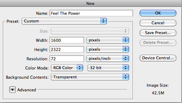
Once the image is copied to the clipboard, go to Photoshop and select new from the file menu. A new file dialog will appear asking you to name the file, choose the size, resolution, colormode, and background. The image size (in pixels) will automatically reflect the size of the image copied to the clipboard. Choose CMYK if this graphic is to be used in print, or RGB for the web. For background, choose transparent (this can always be changed later).

Now that we have an open photoshop document, we can begin to use some of the basic photoshop tools. The next chapter of this tutorial will outline these various tools.

Human Disintegration Effect

| 0 comments


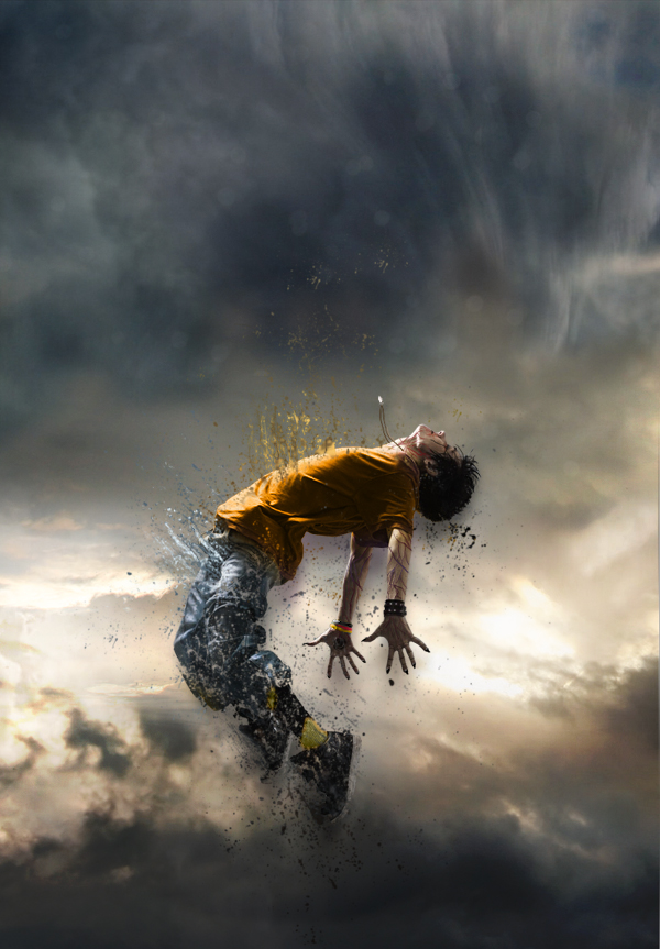
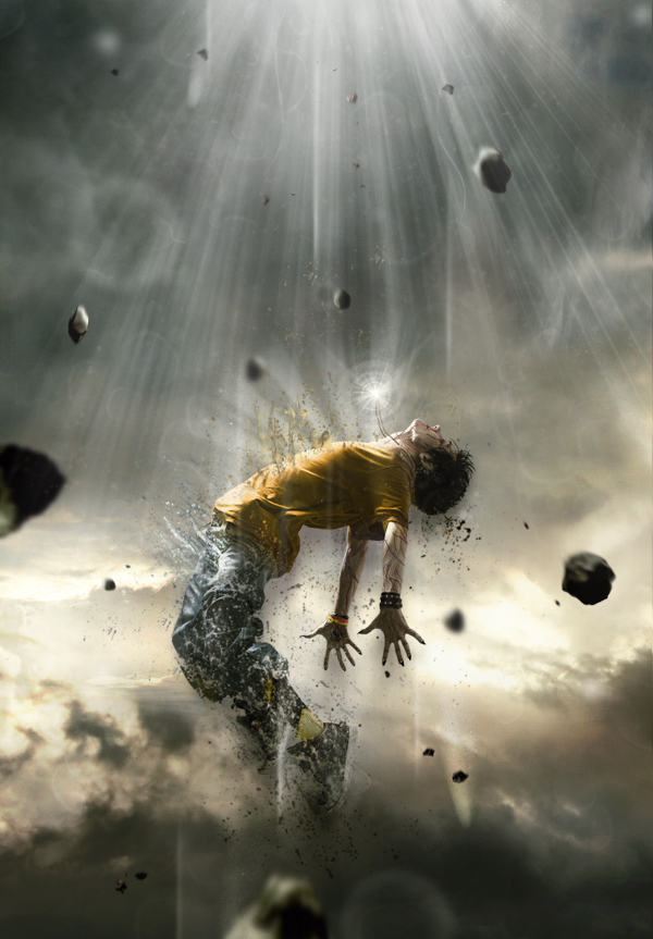
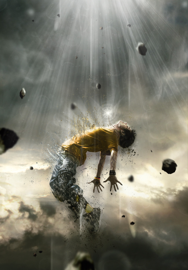
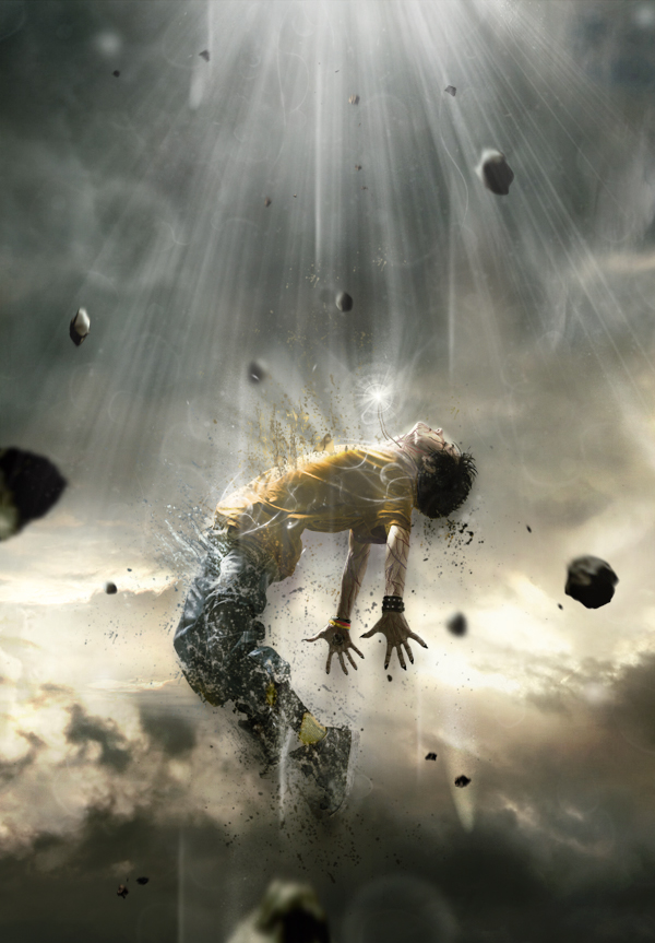
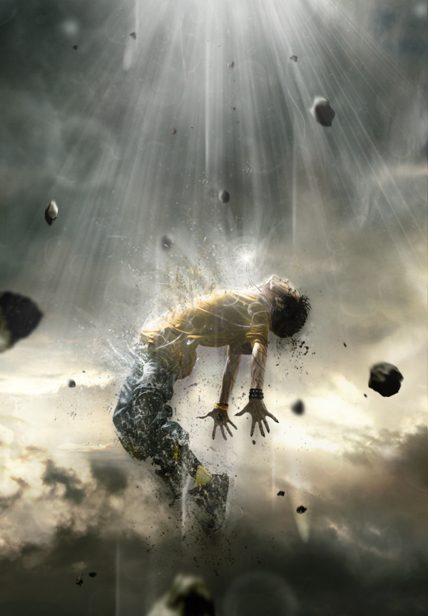
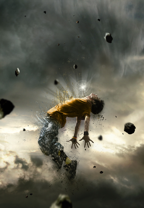
In this tutorial we will create a powerful, and emotional human disintegration effect in Photoshop. Let’s get started!

Tutorial Assets
The following assets were used during the production of this tutorial.
Character
Sky
Meteors
Light (Obsidian Dawn)
Splatters

Step 1
Let’s start by creating a new document in Adobe Photoshop. Choose the size of document you prefer, but try to keep it in a vertical shape, with a transparent background.


Step 2
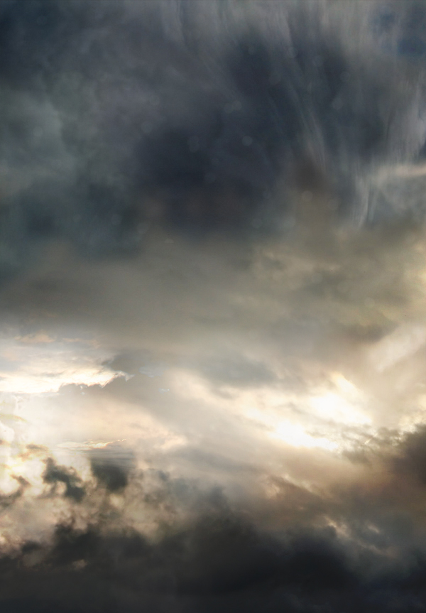
Then, find a good stock image of a cloudy sky that you can use as a background. You can also do like I did by interweaving several pictures of clouds to create the background you prefer. Make sure that the clouds are "dark" enough for a final atmosphere that will fit with the other elements you will be adding to your creation.

Step 3
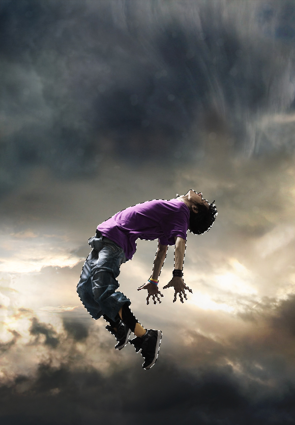
The next step is very important since you will have to choose the character that will be the main focus of your whole piece. To do this, go to websites like SXC, Fotolia, iStock, etc.., and choose a model that projects a strong emotion. Be sure to pick a character that really inspires you, as it will be the main focus of your creation and it will play a major role in your final outcome. Once you’ve selected it, cut out the character carefully by using the pen tool (P) and place it in the middle, slightly shifted downwards.


Step 4
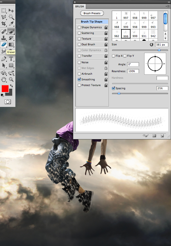
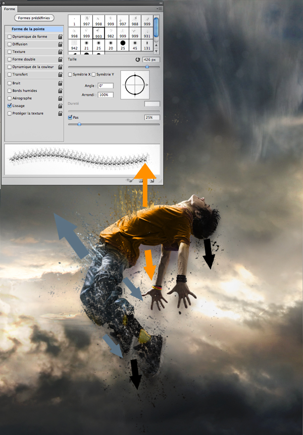
Then, using the eraser tool (E) with the “Splatters” shape – which can be found in the tutorial assets – slightly erase the character’s legs.


Step 5
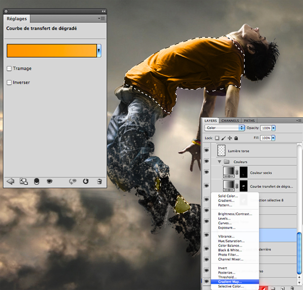
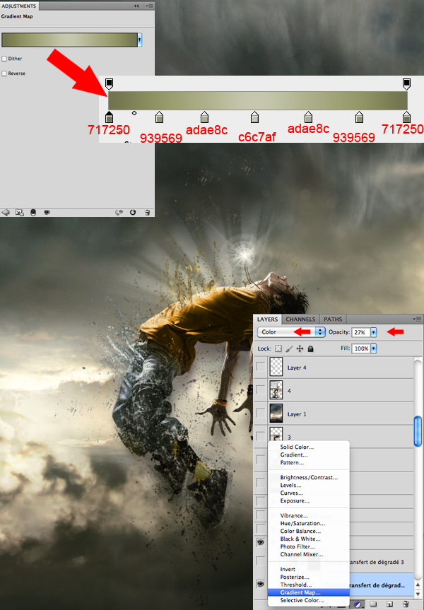
Now, if you are like me and like to change your character’s colors, take the lasso tool (L) and surround the selected areas from your character that you would like to modify. Afterwards, create a layer of fill or adjustment by clicking on the black and white circle situated in the layers tab. In the said tab you will be able to select the method that suits you best. I personally recommend changing the colors with a Gradient Map layer and a Selective Color layer. A tip: avoid fluorescent colors and choose those that resemble your background’s colors.


Step 6
Always with the “Splatters” shape, take your brush tool (B) and, on another layer, create shapes that go above, but also behind the model, as seen in the picture bellow. It is important to use the same colors and shades that you’ve used on your character to create the desired effect of disintegration.


Step 7
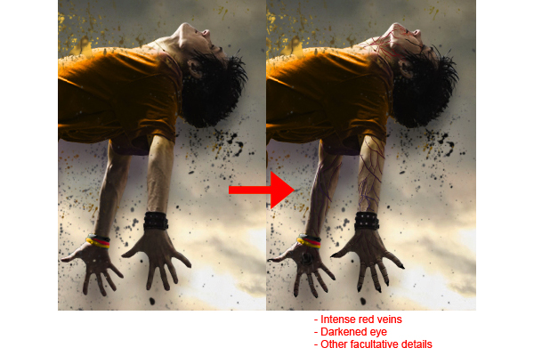
There are numerous ways to give a darker aspect to your character and create the impression that he is possessed. Personally, I usually prefer to draw intense red veins on his arms, neck and face, as well as slightly darkening the eyes and mouth with a small black brush adjusted to “Soft Light”.

NOTE: MUNG NAHIHIRAPAN KAYU GAWIN TONG STEP 7 SKIP NYU SA KUMP NA KAYO SA STEP ACTUALLY DI NAMN KELANGAN TO..

Step 8
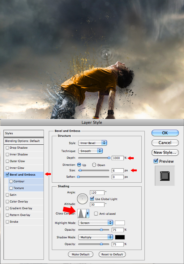
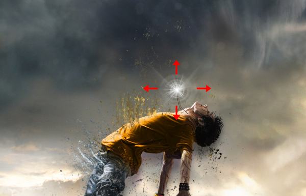
Here, I decided to create a necklace that will later have a supernatural look, suggesting that the character is flying up due to the strength of the accessory. Everything is done with a small brush, by using a graphic tablet.


Step 9
Now this step will give the necklace a supernatural look. In order to achieve that, you will need to create "power waves" emitting from the necklace. On another layer, apply a white area on the necklace using a soft round brush, and then with a smaller soft round shape, erase the middle of that white area. When it’s done, “double click” on the layer to open the “Layer Style” box and enter the data as shown in the picture. Once you’ve done all that, duplicate the layer (Command/Ctrl + J) twice and make them bigger than the previous one. Remember, the more the wave is away from the necklace, the more it’s big and less opaque.


Step 10
To complete the work on the necklace, select the shapes titled “Light” available in the tutorial assets, select your brush (B), and on another layer create a white "light beam" effect coming out of the necklace.


Step 11
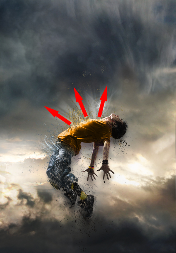
With the same brush shapes, create a white "light beam" effect coming out of the model’s torso, as shown in the image. This effect will give out the impression that your character is liberating some sort of supernatural strengths while disintegrating.


Step 12
Now that most of the work on the character is done, you will need to work a little bit more on the atmosphere. With the fill or adjustment layer, at the bottom of the layers tab, darken the colors and make them closer to those of your character. Again, there are several ways to do so, but I suggest the Gradient Map layer and the Selective Color layer.


Step 13
Afterwards, put some action in the scenery by adding meteors coming down from the top. You will find a pack of meteorites in the tutorial assets. Insert them one by one, making sure that their sizes vary and that their colors stick with the atmosphere.


Step 14
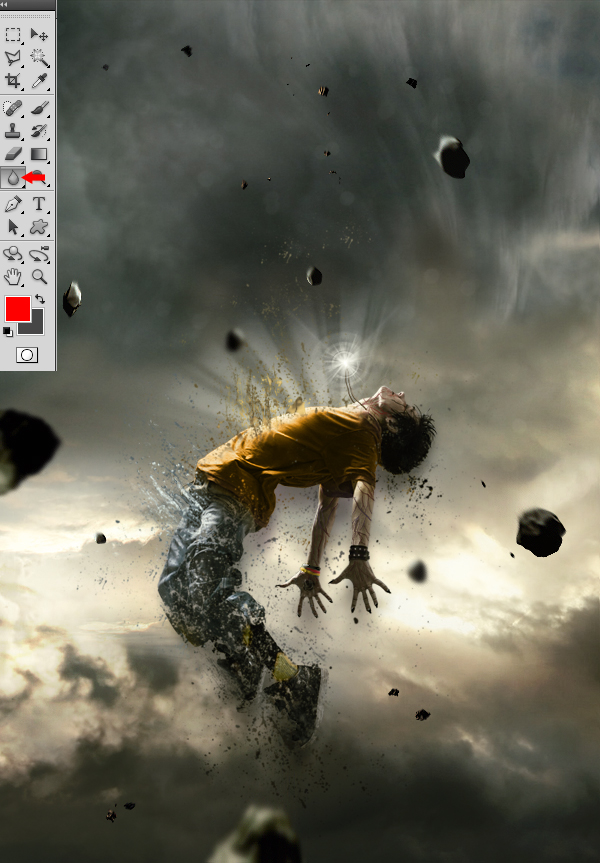
This next step will consist in using the blur tool on the meteorites to make them look either close or far. Those that will be situated at the same distance as your character will remain untouched. Basically, the more a meteorite is far from the model, the greater the blur.

Step 15
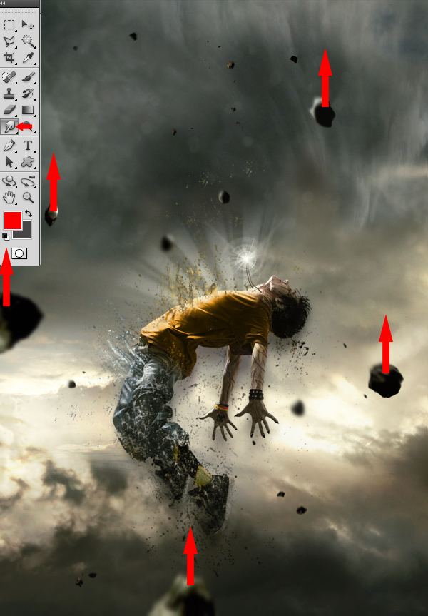
Now, take the Smudge tool with strength of 5 to 10% and apply it on each of the meteorites, using little movements from bottom to top, to give them a speed effect.


Step 16
To create a source of light coming from above of your character’s body, take a white brush tool (B) with the same “Light” shape used in Step 10 and 11. It is important that the rays coming from above are more intense than those coming from your character’s torso. You can also draw various small shapes that follow the same rays’ movements to make it look more magical.


Step 17
Once you’ve completed the previous step, return to your character to improve it. With the presence of the new light source from above of your character’s body, you must increase the light reflected on its torso and face area by using a soft round white brush adjusted to “Overlay” mode.


Step 18
Now, draw some light effects passing around your model’s body so he can be integrated better within the scenery and be surrounded by more power.


Step 19
You can always add more “Splatters” if you find that the model does not disintegrate the way you want it to.


Step 20
To finalize everything, you can return to the colors, contrast and even intensify the bright areas with the same techniques you’ve used before. Basically, this step consists in putting your last personal touch to your piece! When you feel that your piece is finished, use a sharpness filter, to ensure a better overall quality, by duplicating your final image and by going to Filter > Sharpen > Sharpen.


I HOPE YOU LIKE IT
 
Support : Arnold Merch | Facebook Page | Strings and Harmony
Copyright © 2012. Your Stations - All Rights Reserved
Template Modify by Creating Website
Proudly powered by Blogger